LATEST NEWS
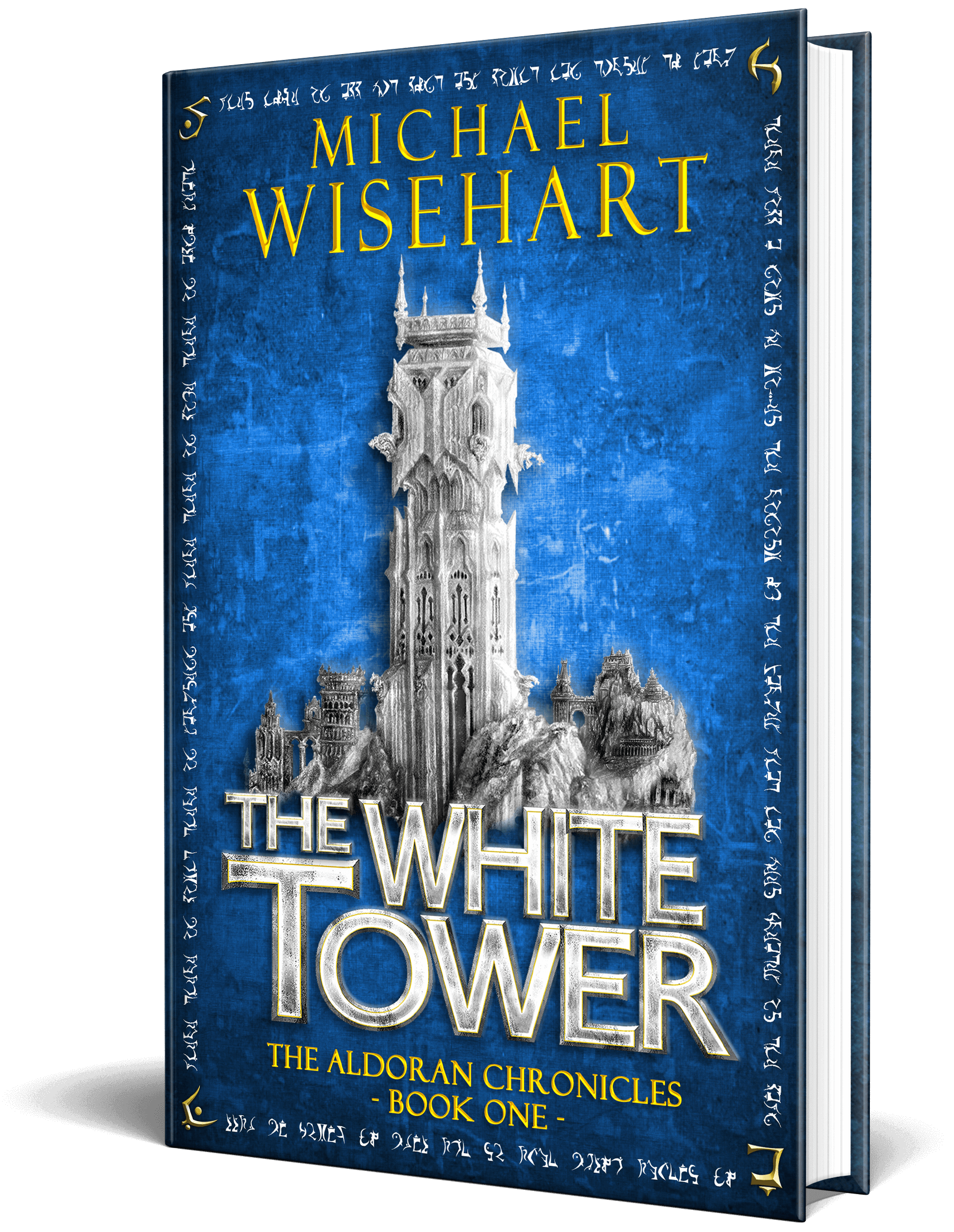
The White Tower Cover Art Progression

Michael Wisehart
4 August 2016
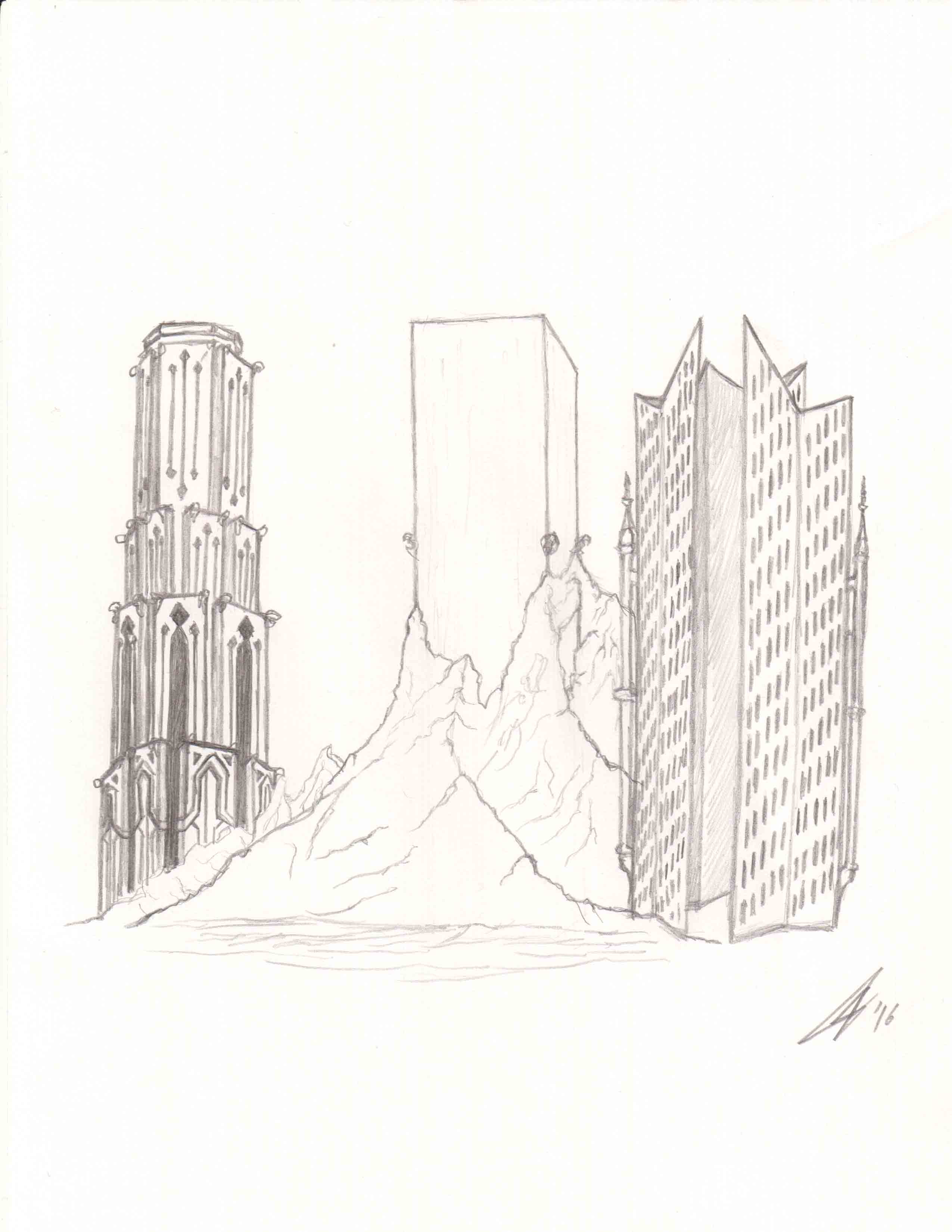
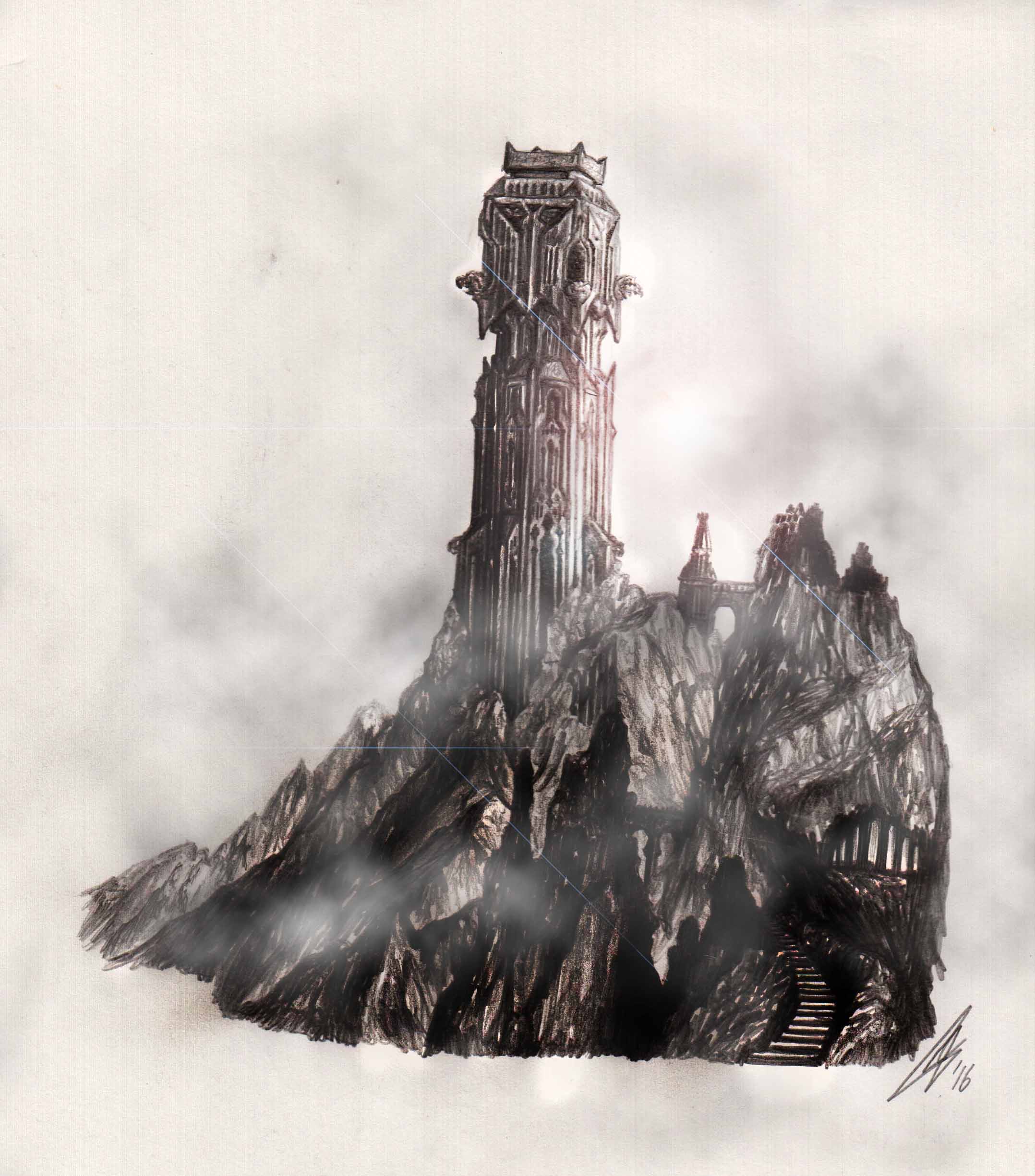
The below images are the first two sketches my illustrator gave me when we first began our work on designing the White Tower. He started the process by creating six simple sketch ideas. He wanted to make sure that we were on the same page as to the overall design before he began work on a more detailed sketch.
(Click on the images for a larger view)
Of the six drawings he had given me, the one that best represented the White Tower’s overall design was his design of a simple cube rising up out of the mountainside. From there I gave him a detailed description of the White Tower fortress and how I had envisioned it looking and he got started on his second, more detailed sketch. It was better than I had hoped!
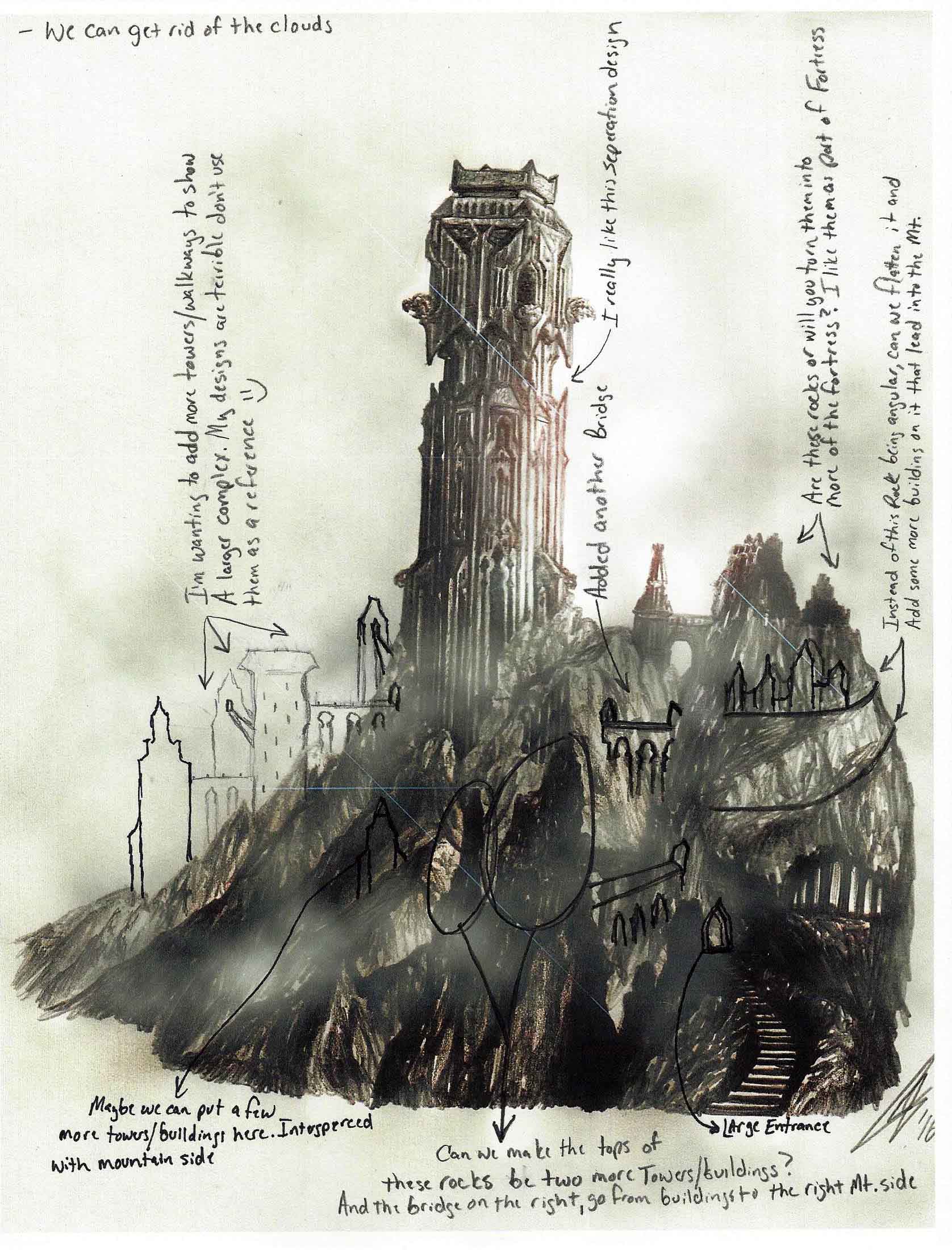
After receiving his final sketch, I went through and added a copious amount of notes and simple outlines for him to take a look at before beginning the final version of the White Tower. Below is his sketch with my hand drawn notes over top.
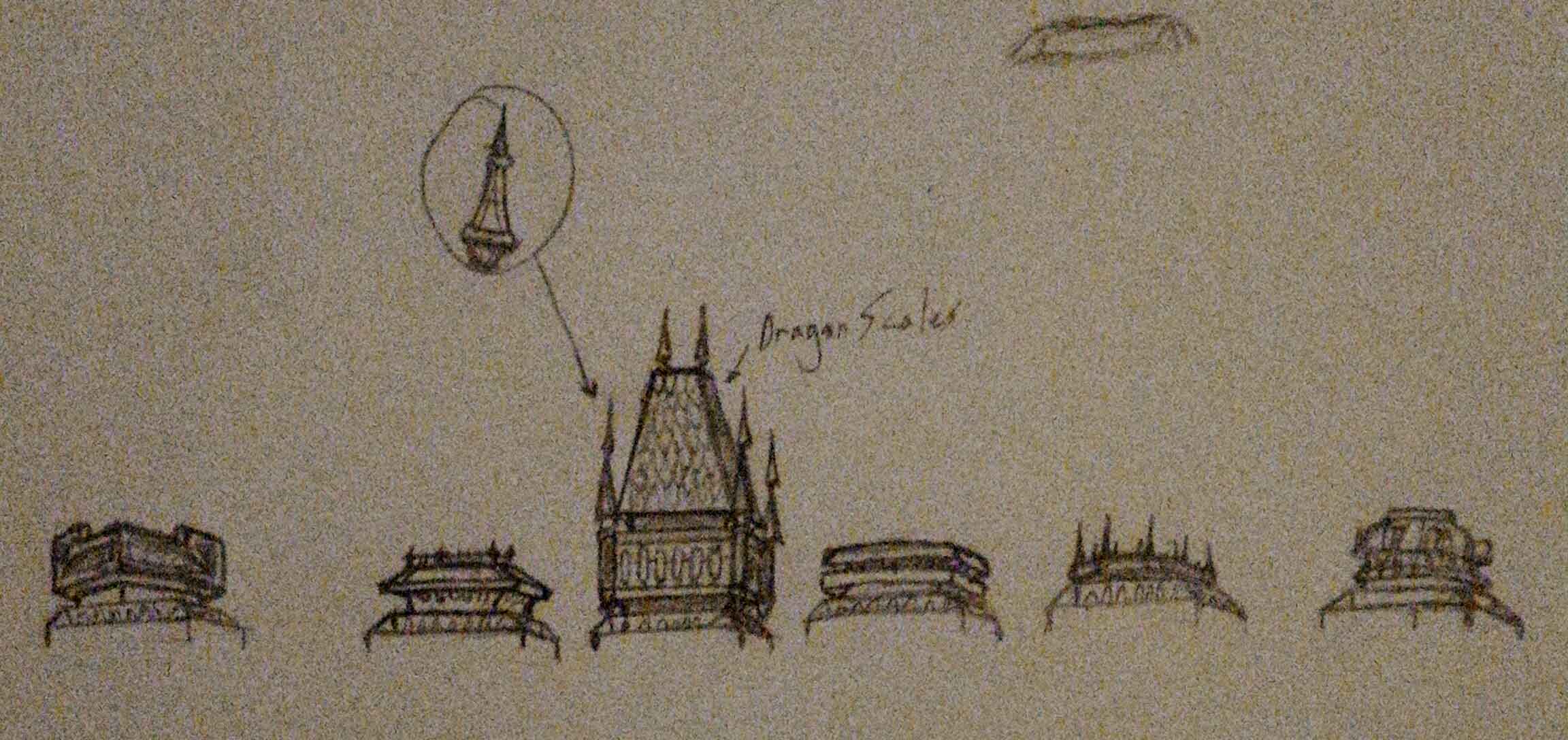
Along with my notes I wanted to try to give the top of the tower a slight alteration. My illustrator quickly sent me a couple variations to choose from before he got started. I liked his third idea with the dragon scales. I wanted to use that for the surrounding buildings, but I didn’t want the top of the Tower to have what looks like a typical roof. I in turn had him use the bottom half of the sketch for the top of the Tower. He gave me exactly what I asked for.
Below is the Final Render of The White Tower Fortress.
Once I had the final render complete I had the laborious job of finding a way to place it within the front cover and spine of my book. Below is the final version of my cover art.



Congratulations to you both. Michael has woven a beguiling spell of his own, sucking his readers into the story and giving us characters we can care about [and loathe].
Watching the progression and collaboration from Mr. Adams, I must protest jealousy in the extreme. Your work [and obvious work ethic], Mr. Adams, is top-notch, and elicits Michael’s vision extremely well. The ability of the Tower itself to fit on the spine is an unexpected bonus. Very well done, sir.
Having worked [unsuccessfully] with a number of artists who tend to disappear, your work ethic, attention to detail, and ability to work with an author make you a fellow to watch.
I’ll be visiting your website!
“I love it when a plan comes together!” Now to put this cover with the story. I expect it to be snatched up.
WOW!! MAJESTIC! Emanates POWER!
Oh, wow! It’s a beautiful cover. It gives me chills just looking at it, Michael. Awesome artwork for an incredible book. So excited for you.
Thanks Michelle. I guess your comment went through after all 🙂
I am starting work with my illustrator on a new image for another cover I’m hoping to finish this month.
It’s absolutely beautiful work. I love the cover and the blue is pretty. If I could have any super power I think I would want to be able to heal any wound or disease with a touch. Of course I would want to be able to heal myself as well as other people and anything living i.e. animals or poisoned trees.
Thanks for your thoughts on the cover.
Healing is a great ability. Unfortunately in Aldor, those with the gift are rarely able to heal themselves since their gift stems from their own inner strength. Those that can, do so with care over an extended period of time.
I love it. It is beautiful and ominous. No one could mistake it for some fairy princess castle. Good job, Michael.
The Lady T’Kaat of Kaat’s Keep
Yes, it would be quite a disturbed fairy princess who wished to live there. -lol